The United Nations backed the new Equal Earth world map. The Mercator projection, created in 1569, is just one visual representation of the landmasses designed to facilitate sea navigation.
The Mercator projection is also a PITA for radio signal propagation analyses.
We have four Beverage antennas for long-wave, low-frequency bands. To have an idea of which direction the antennas are pointing, a simplified but “somewhat representative” lobe plot of the blue antenna on a Mercator projection map looks like this:
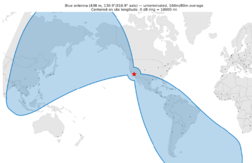
While correct, it sits askew in the human brain — the wire can’t seem to cover a “narrow” slit of South America while engulfing everything from western Canada to Asiatic Russia, Japan, much of China, and Indonesia.
A Mercator projection is already an unfulfilling attempt to flatten a sphere onto a rectangular sheet; A little fudging of the pattern to aid comprehension was fair game. It resulted in this plot:
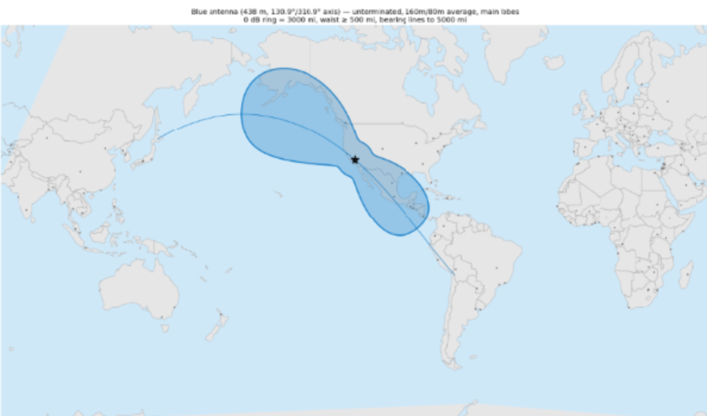
Besides being easier on the brain, it also aids glanceability on our custom Beverage antenna switching device, which rotates between four antennas on a 3.5-inch screen. Here’s how the four maps look with a bit of a “cartoon” treatment:
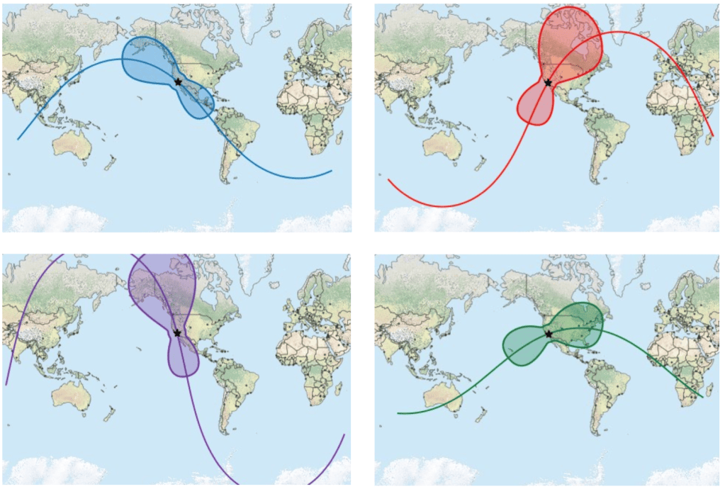
Tweaking maps for specific purposes, from navigation to readability and data analytics, is nothing new. For our setup, the improved glanceability helps us ingest more information quickly and identify relevant data much more easily.
 ClearSkyRF
Leave a comment